

As a user I want to review the activity of my account so that I can see who mentioned or replied to me or what is the latest activity on the spaces I follow
Acceptance criteria
We merge activity and notifications under one ➡ section called Activity.
When clicking the bell icon on the top right, it opens a side panel.
There are 2 sections:
@toyou (what is notifications today)
All updates (what is feed today)
1. @toyou
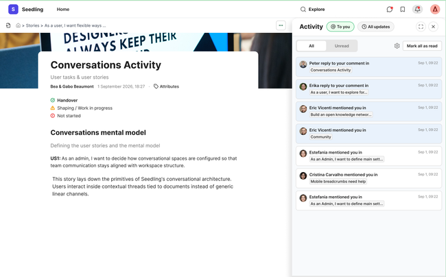
By default it shows notifications where the user is mentioned or replied:
When user taps one notification the related document or paragraph will be open in the center for context
In this section user can see all or just unread (as it is now)
In this section user can mark all as read (as it is now)
In this section user can tap the notifications settings.
The current dialog needs to be improved by removing the Close button and making bigger the dialog.. Two scenarios:
User haven't added email: User can add email and Click "Save"
User have added email: User can remove the email manually or by clicking "Remove Email" and then click "Save" to save changes
User can expand the Activity panel to see it full screen. In this case, will lose context of the document.
UI related, the name of the document is visually more differentiated from the action (mentioned, replied...)
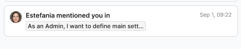
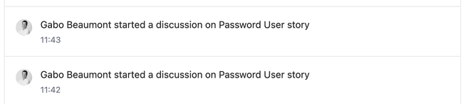
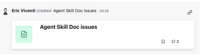
We need to optimized the number of notification, sometimes for 1 actions there are 2 notifications (see example).
2. All updates
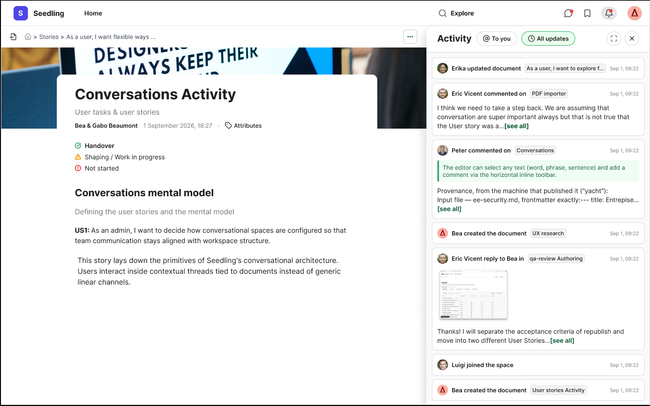
Updates shows latest events on the spaces User joined. Events can be:
User updated document
User commented on a document
User replied to someone (would be nice to have, but maybe we need to simplify with "commented"
User joined a space
User created a document
When user taps one specific item, the related document will be open in the center for context.
If its a comment, comments section will be replacing in the sidebar.
UI improvements: I proposed from what we currently have:
Encapsulated the updated events in white boxes to improved readability.
Remove document cards from the event
When comments are on media, make images and videos preview smaller and expand when clicking on them.
Allow a maximum of text on the event by truncating it and adding [see all].
User can expand the sidebar to see Activity full screen and collapse it again at any time.
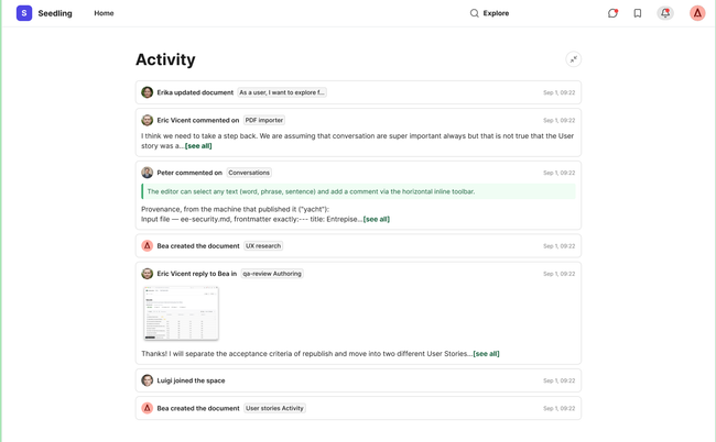
Design
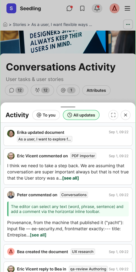
Email notifications dialog UX improvement
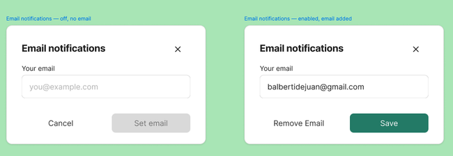
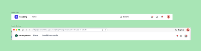
Header tools distribution updates:
Chat, Activity and Bookmark ➡ space-related
Explore ➡ not space related. Not just and icon but as in design to differentiate from others.
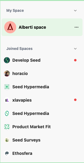
We had a red dot on spaces which have notifications.
Do you like what you are reading? Subscribe to receive updates.
Unsubscribe anytime